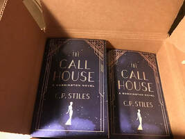
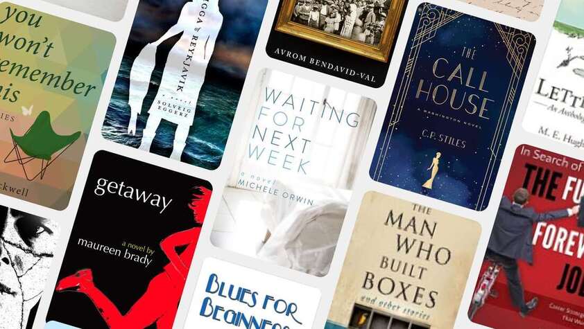
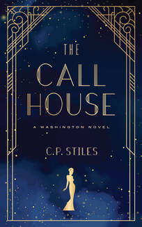
 I could look at book covers for hours – yes, this was even before we were stuck inside. I’m interested in how styles have changed. Not so much from one year to the next, but maybe over a decade. Tastes are different; readers are more sophisticated. Sometimes the distinctions between genres starts to blur - what used to be a typical romance cover now looks very much like historical fiction. Or is it the other way around? One of the most satisfying parts of running a very small press comes when the cover designer creates a cover the author is pleased with. And the cover designer I usually work with, Al Pranke, has a knack for getting what an author is looking for even when they don’t know and I had something else in mind. So how did I end up with a cover on one of our books that just wasn’t right? I have no idea. Al produced his take on what I said I wanted for The Call House. A book about a high-class brothel that doesn’t have any sex. (I know. If you read the book you’d understand.) So I didn’t want to oversell the sexy part. Set in Washington, but it’s not political, and yet I wanted that Capitol dome somewhere in the background. You can probably tell I just wasn’t sure what I wanted and on top of that – the book is funny. So the cover needed a bit of whimsy and it had to indicate the setting was the 1940s. Asking too much? Probably, but Al came up with a design that made sense - he’s got a great imagination and fine illustration skills. He produced a cover we both liked. I wasn’t in love, but maybe I wasn’t ready to be in love. Here’s what happened. Readers enjoyed the book. Lots of great reviews and a whole stack of stars. But. It wasn’t selling. There are a few possibilities when that happens – but first among them is the cover just doesn’t appeal to people. So I dithered and debated for months. Should I change the cover? Could I afford it? Was it worth the trouble and just how much trouble was involved? What held me in back? I operate Bacon Press Books on a shoestring. Less than a shoe string. No margin, no reserves. In other words, money is tight. Was there any chance the money spent on a new cover would actually produce new sales? (Forget the hype from authors who say they changed the cover or the keywords or the book description and sales skyrocketed. I don’t believe it.) So I waited. Always in the back of my mind was the plan to re-do the cover when I had the extra money. I held off until I couldn’t. Al, had just created a cover for the latest book, Waiting for Next Week, that I love. And there is something different about loving the cover that makes you (or maybe it’s just me) feel really good about having your book out there. I wanted to feel that way about The Call House. And as long as we’re being honest – what’s one more charge on a credit card I’m paying off slowly anyway? Keep in mind this was all before the virus hit. When life was ‘normal.’ On top of that, I’d recently read somewhere that flying appendages don’t do well on book covers. As someone who’s always teaching writers not to use detached body parts–his eyes slid past me; I saw the top of his head bobbing down the stairs – you get the idea; I immediately understood why a flying appendage wasn’t a good idea. So I saved up as much as I could and decided to take the leap. I asked Al for a new cover for The Call House. We still had the same constraint – I didn’t want it to be too seductive despite the subject matter. But I wanted classy, clean, modern yet evoking 1940s. And we could lose the Capitol. He did it. He created a cover I could fall in love with. It makes all the difference in the world. It’s like the book has been wearing all the wrong clothes and now it’s dressed the way it should be. The best part about independent publishing is that you can change things immediately. And I did. Although Amazon is a little slow to catch on in matching the paperback and eBook. I was all set until I opened the book. This is the part I almost forgot I couldn’t change the cover without changing all the title pages and chapter headings and section headings – the fonts that had worked before, no longer were right. Fortunately, the body text was compatible. Even more fortunately, the terrific people at eBook launch who had done the original interior were able to make the changes at a reasonable price, even when it meant they’d have to purchase a new font to match the new cover. They were very responsive and did everything quickly. That hard to explain thrill when something goes right and looks good How many times have we seen the scene in the movies when the author works like crazy, sends off the manuscript, gets the book accepted by a publisher, and holds the book in their hands? Now, thanks to social media, we can see the thrill of an independent author opening their first box of books. It doesn’t matter who publishes the book – it’s still a kick. So I’m happy to send The Call House out in the world wearing its classy new cover. I’ll write again and let you know if it makes a difference in terms of sales. But in the meantime, if you keep looking at your book and you keep thinking something just might be a little off, you might try a new cover. Just remember to redo the interior as well. And okay, pick up a copy of The Call House - it's a good summer read.
0 Comments
Leave a Reply. |
Bacon Press Courses &
|

